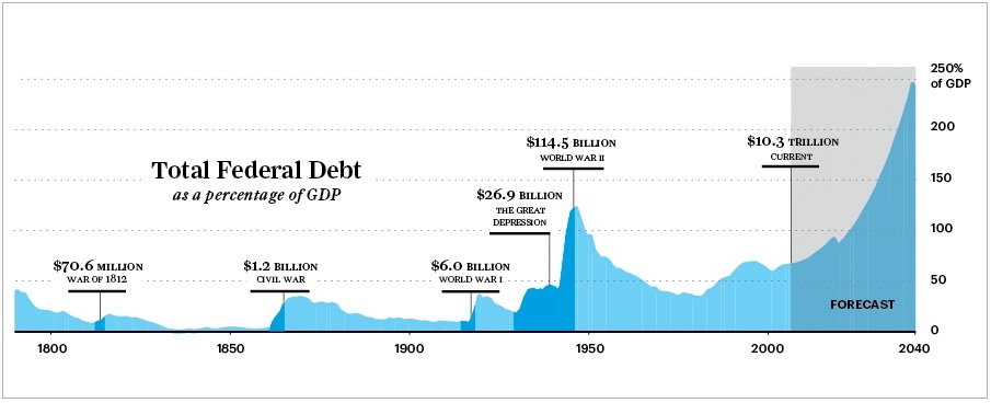
I found this chart of the Federal Debt as a percentage of GDP on Condé Nast Portfolio.com. It's about three months old, and I'm not sure what the massive future increase is based on.
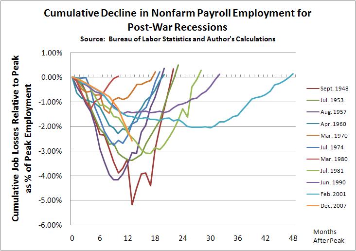
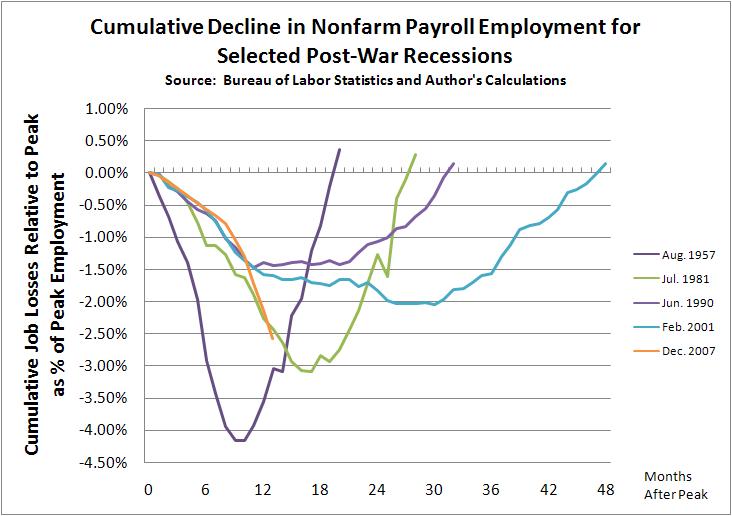
Here are two charts showing the duration and percentage decline in employment for recessions since WWII—i.e., since, but not including the Great Depression—from the maximum pre-recession levels.
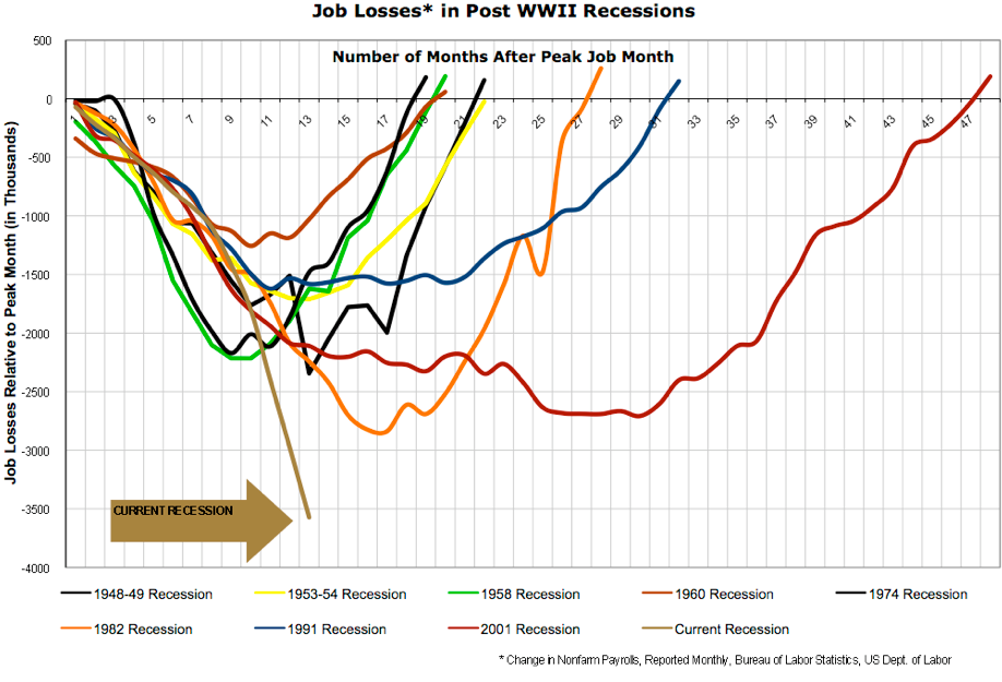
 The next chart is slightly different, showing the number of jobs lost, rather than the percentage. Since the population and economy have both been growing since WWII, the current recession effects more jobs and people than earlier, but similarly deep, recessions.